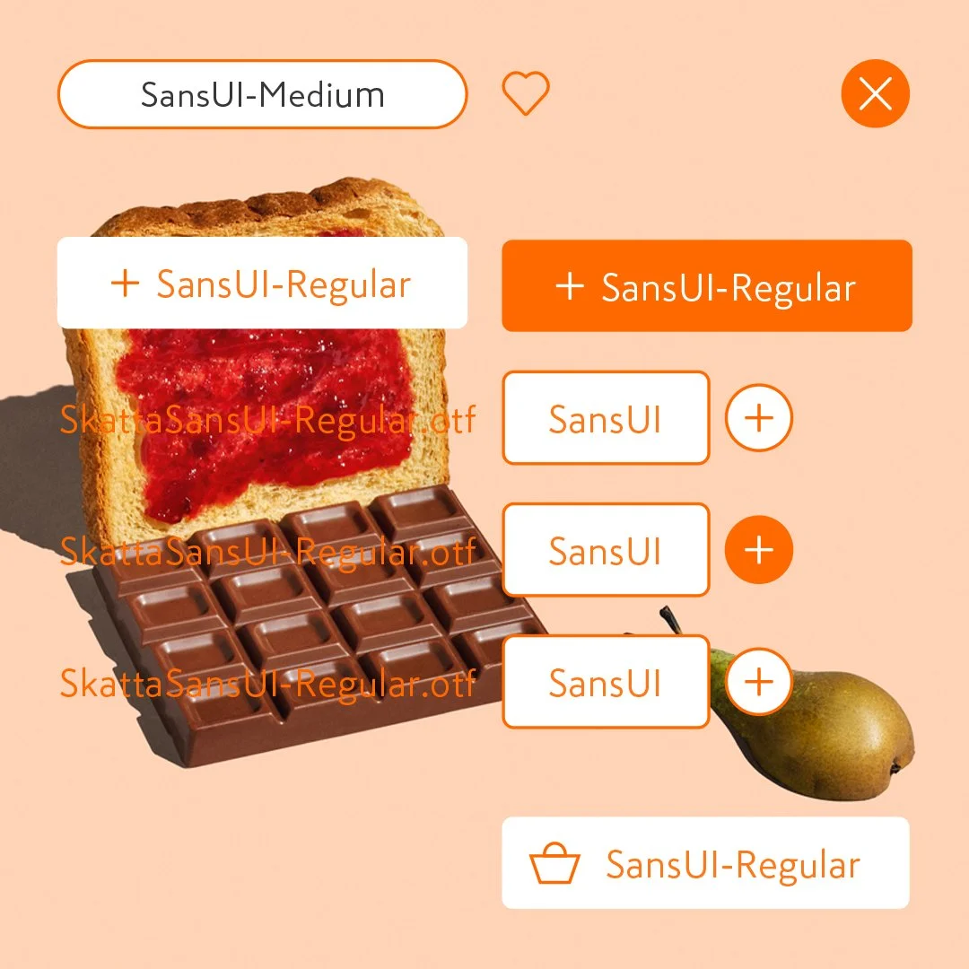
Derived from an extensive turnaround strategy for Kesko and its affiliated K-brands, the redefined direction demanded a unified and modernised brand identity. The goal was to streamline all K-Group identities under a cohesive umbrella through introduction of a single brand unifying orange colour. To enable flexibility for individual store brands to express their unique character a series of carefully crafted shared core assets were introduced. For example, the Skatta custom typeface family was universally implemented across each chain brand, complemented by a distinct typeface tailored to each specific chain's characteristics.
Challenge: As part of a broader turnaround strategy for Kesko and its affiliated K-brands, the company needed a unified and modernised brand identity. The challenge was to streamline multiple store brands — including newly acquired grocery chains — under a cohesive visual umbrella, while allowing each brand to retain its unique character. The system also needed to be strong and flexible enough to support future growth, acquisitions, evolving retail formats, and provide ownable tools for internal teams and external partners.
Approach: A bold, brand-identifying orange was introduced as a unifying colour, creating immediate recognition and a clear competitive mark in the market. Its origins lie in Kesko’s Plussa loyalty program, linking the refreshed identity to an established, trusted element of the brand. A suite of shared core assets was developed, including the Skatta custom typeface family implemented universally, complemented by chain-specific typefaces to maintain individuality. The flexible, scalable system — colour, typography, and supporting assets — provided internal teams and external partners with clear, ownable tools to communicate the brand confidently, supporting cohesion across all touchpoints while enabling growth, acquisitions, and evolving retail experiences.
Outcome: The redefined brand direction successfully modernised and harmonised the K-Group identity, integrating both established and newly acquired grocery brands. The orange colour created a distinctive market presence, while chain-specific typefaces preserved individuality and local relevance. The system strengthened brand recognition, operational clarity, and partner confidence, providing a scalable framework to support growth, acquisitions, and evolving retail experiences across the entire K-Group network.
Kesko/K-Group is a Finnish trading sector pioneer operating in the grocery trade, building and technical trade as well as in the car trade. Its divisions and chains act in close cooperation with retailer entrepreneurs and other partners. Kesko has around 1,800 stores in Finland, Sweden, Norway, Estonia, Latvia, Lithuania and Poland. It is the third largest retailer in Northern Europe and it employs around 45,000. Their brands include, K-Market, K-Supermarket, K-Citymarket, K-Rauta, Onninen, Byggmakker, K-Bygg, K-Auto. In 2023, Kesko ranked as the most sustainable grocery trade company in the World.