Sector: Cafés / Restaurants / Hospitality
Identity for Mariankatu 18 / M18, a local cafe at the centre of a rich vibrant community in Helsinki. In line with the up-cycling of the spacial elements, the logotype is derived from the black & white floor tiles which were remaining from the previous tenant.


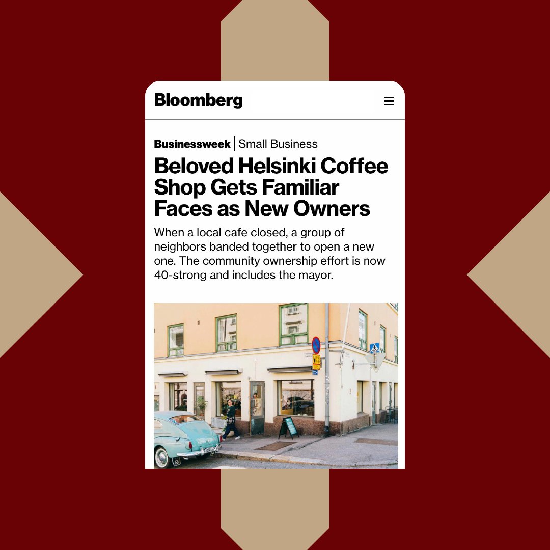
Challenge: When a beloved neighbourhood café closed, locals in central Helsinki came together to save it — forming a community-owned venture that became Mariankatu 18, or M18. The challenge was to create an identity that captured this collective spirit while reflecting the café’s upcycled interior and sense of place. The brand needed to feel authentic, familiar, and grounded in the everyday life of the surrounding community.
Approach: The design drew directly from the space itself. The M18 logotype was inspired by the black-and-white floor tiles left by the previous tenant — a humble architectural detail turned into a defining visual symbol. The underlying grid structure derived from the tiles became both a compositional tool and a metaphor for people coming together to form something greater — echoing the café’s community ownership model. Material choices and layouts emphasised tactility, simplicity, and warmth, aligning with M18’s values of sustainability, inclusivity, and shared creativity.
Outcome: The resulting identity feels both local and lasting — a visual expression of community and place. The tile-inspired logotype and grid-based system root the café in its physical surroundings while symbolising the collective spirit that revived it. M18 stands as more than a café: a living example of how design can reflect belonging, collaboration, and the everyday joy of shared spaces.
Featured in Bloomberg Businessweek