Challenge: Royal Doulton, a heritage English porcelain brand founded in 1815, needed to refresh its brand identity to stay relevant in a modern, design-conscious world. The challenge was to respect over two centuries of craftsmanship and British heritage while introducing a contemporary expression that could connect with today’s urban and globally minded audiences. The renewed identity needed to bridge tradition and modernity — retaining authenticity without feeling nostalgic.
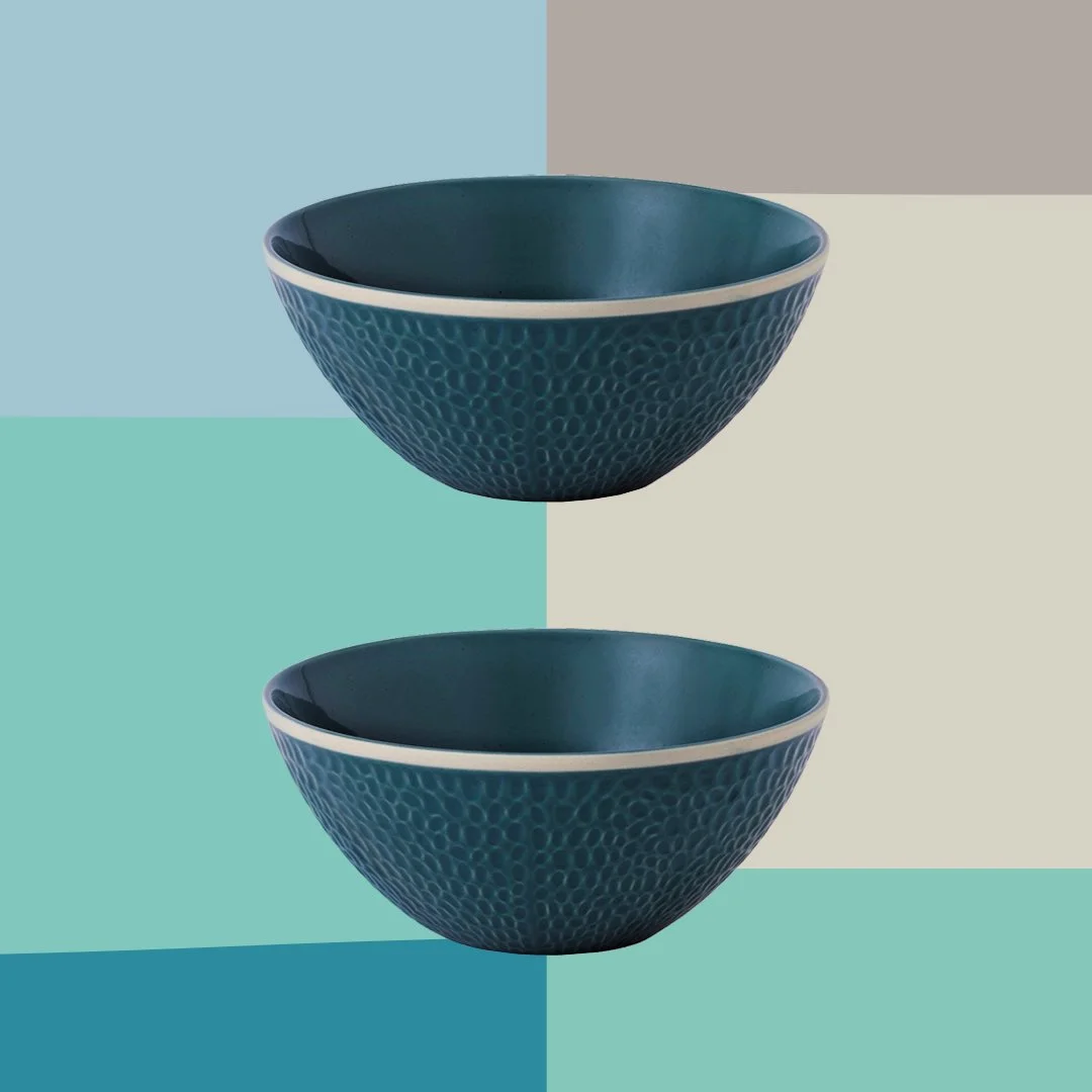
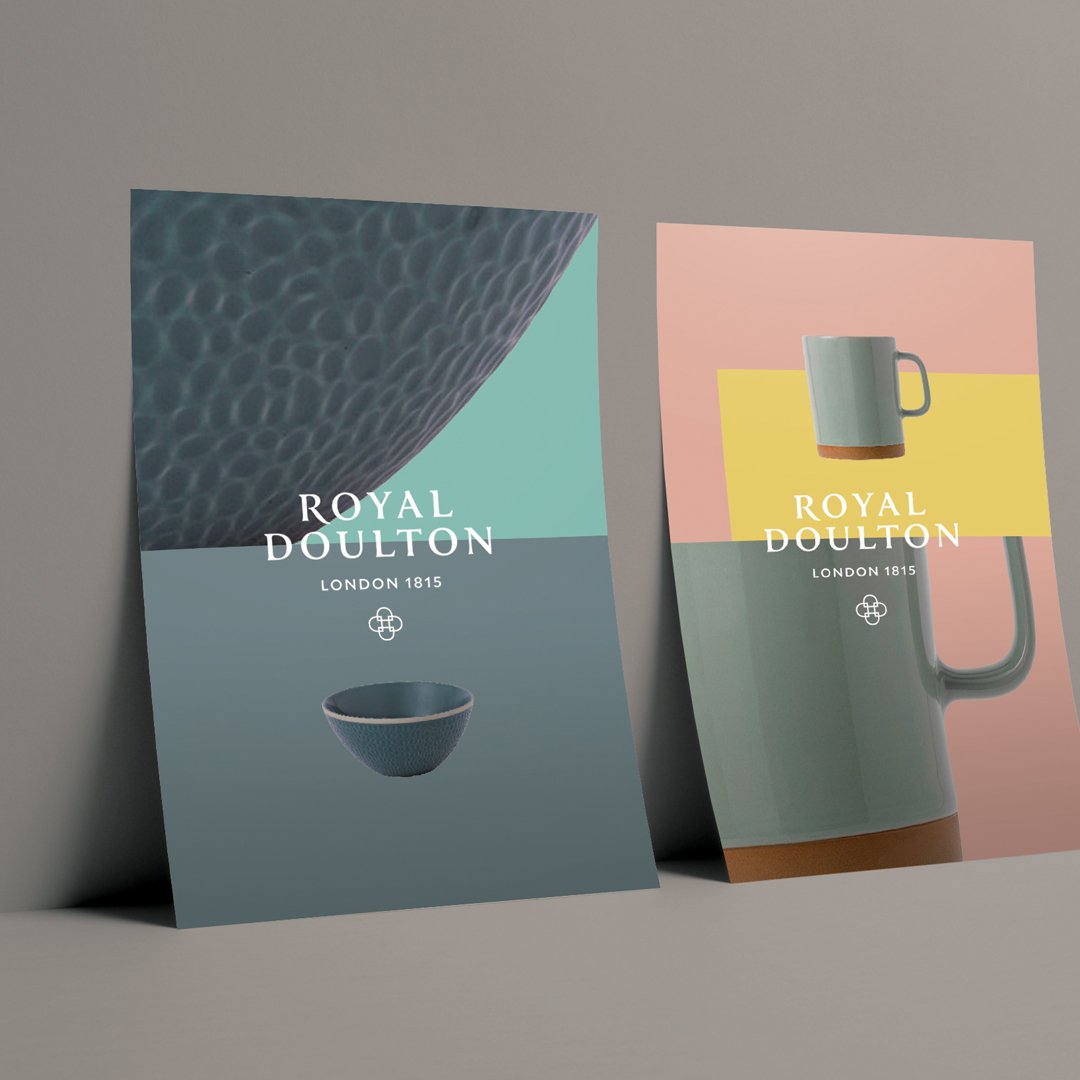
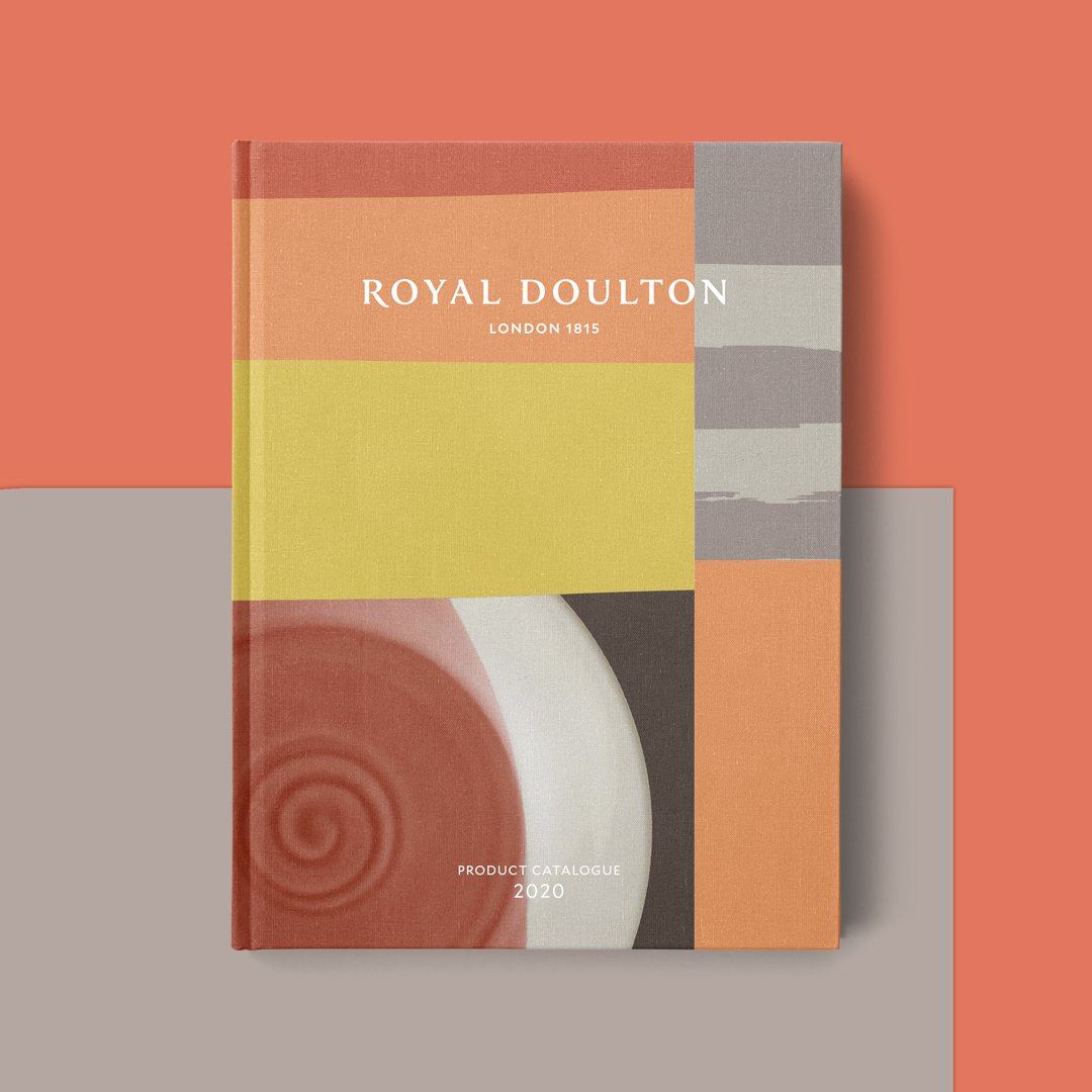
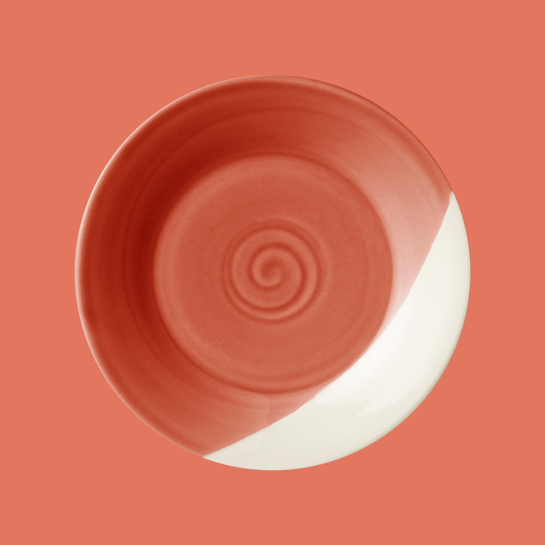
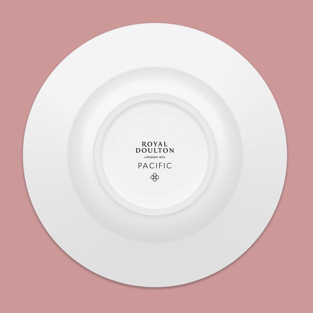
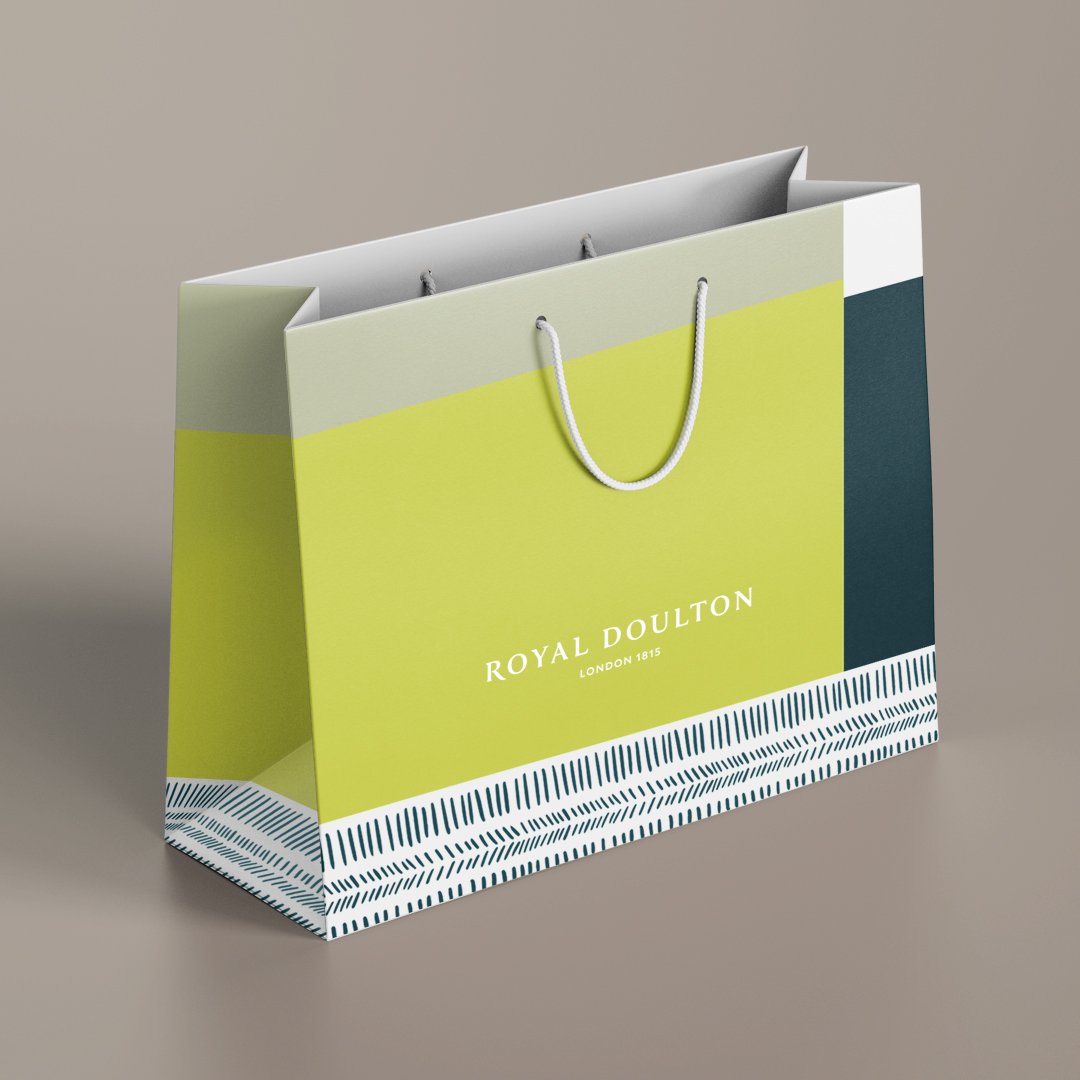
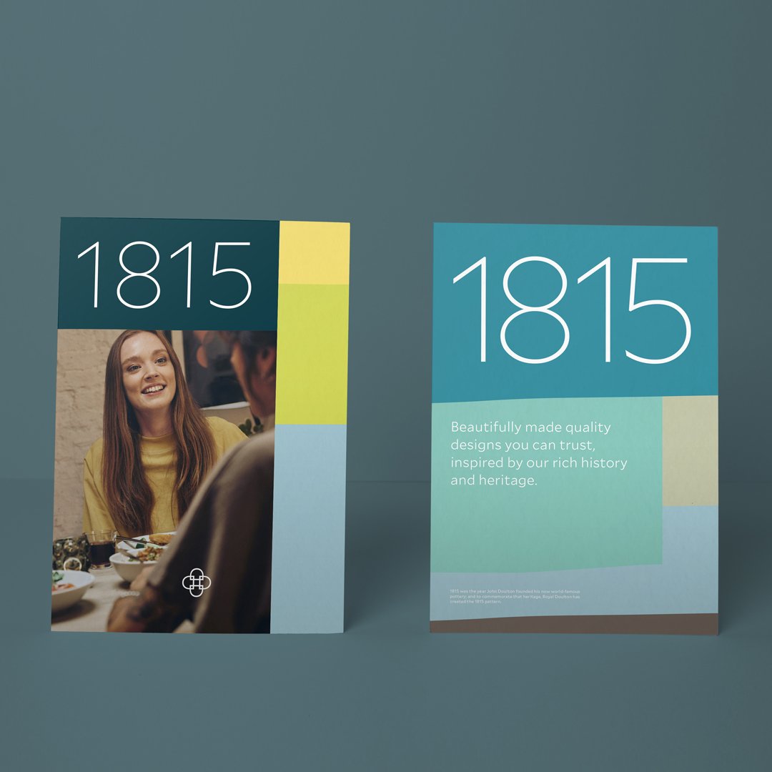
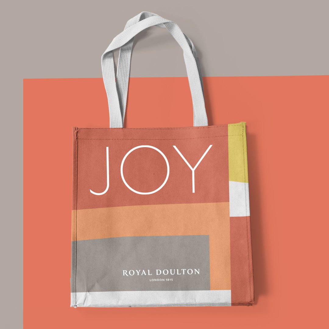
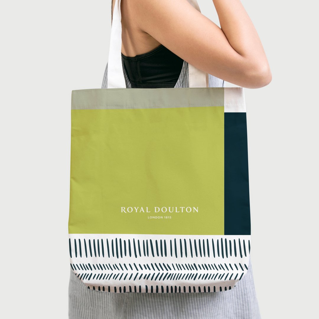
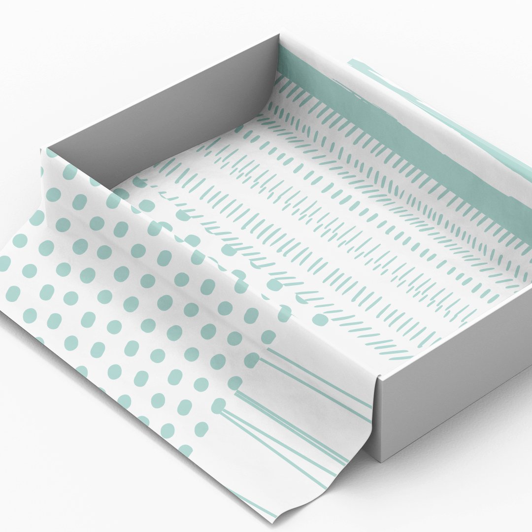
Approach: The new visual identity was built on the philosophy of “perfectly imperfect.” This idea became the guiding principle for all design decisions, celebrating contrast and balance — from the interplay of an eclectic colour palette symbolizing imperfection, to a defined grid system representing precision. The refreshed identity combined heritage cues like the interlocking D’s symbol and the “London 1815” mark with modern design elements, warm tone of voice, and authentic, documentary-style imagery. Together, these components brought forward a brand that feels both confident and human — sophisticated yet relaxed, rooted in London’s diverse culture.
Outcome: The renewed Royal Doulton identity successfully unified the brand’s communication across digital, retail, and product touchpoints. It gave new relevance to the brand’s heritage, translating the idea of “perfectly imperfect” into a modern design language that feels bold, inclusive, and unmistakably Royal Doulton. The identity now embodies the brand’s timeless craftsmanship while expressing a fresh urban sensibility — ensuring its continued resonance with new generations of design and lifestyle enthusiasts worldwide.