Sector: Fashion / Interiors / Design
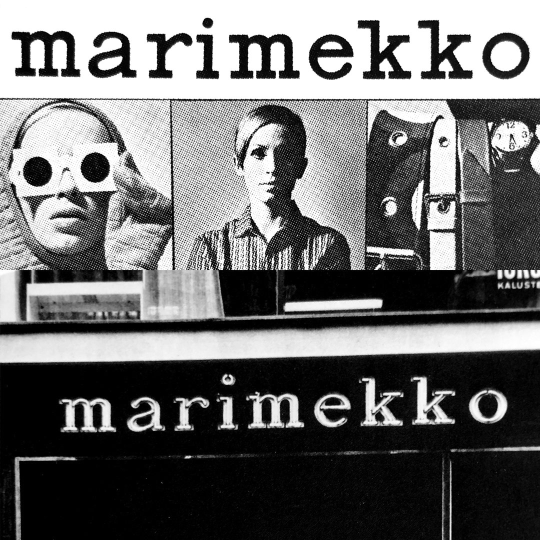
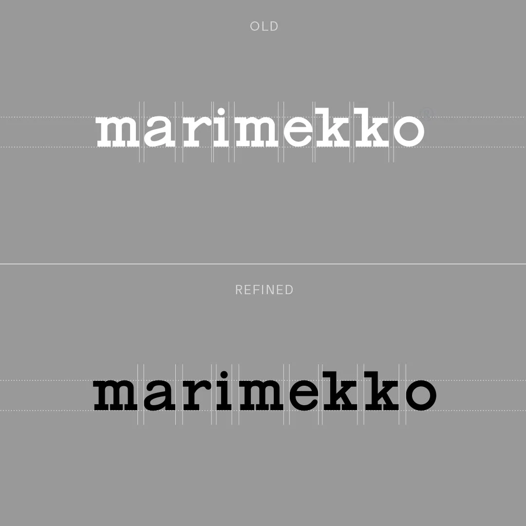
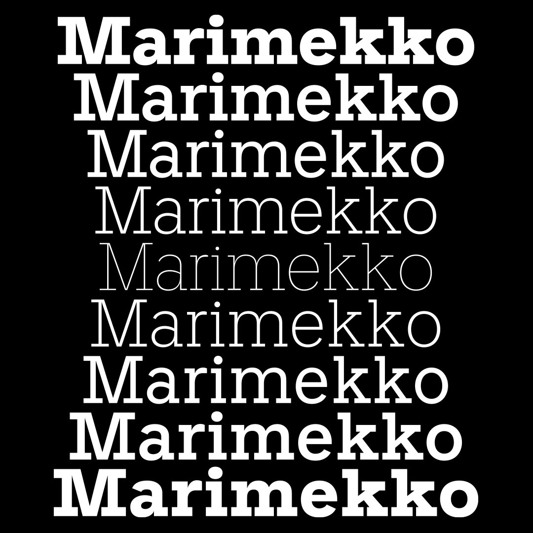
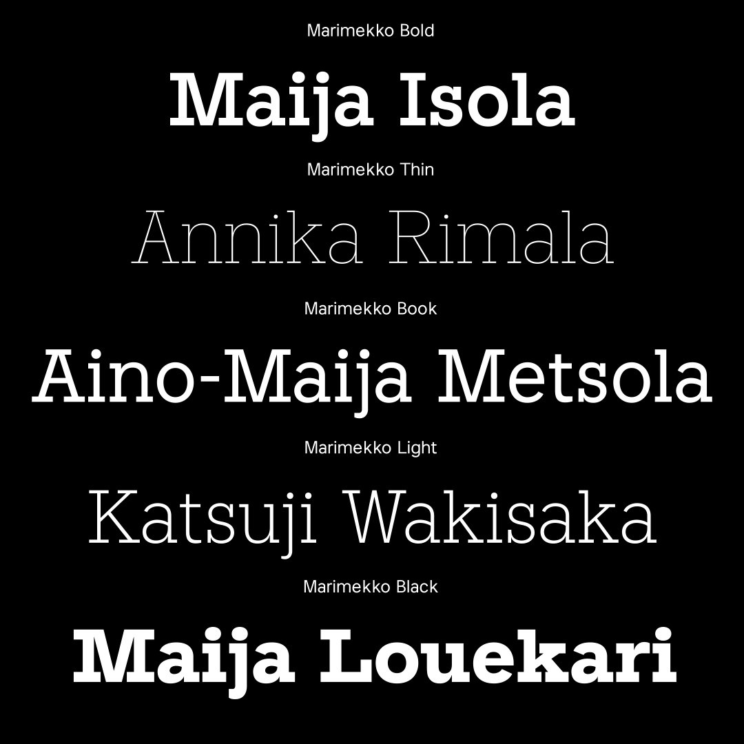
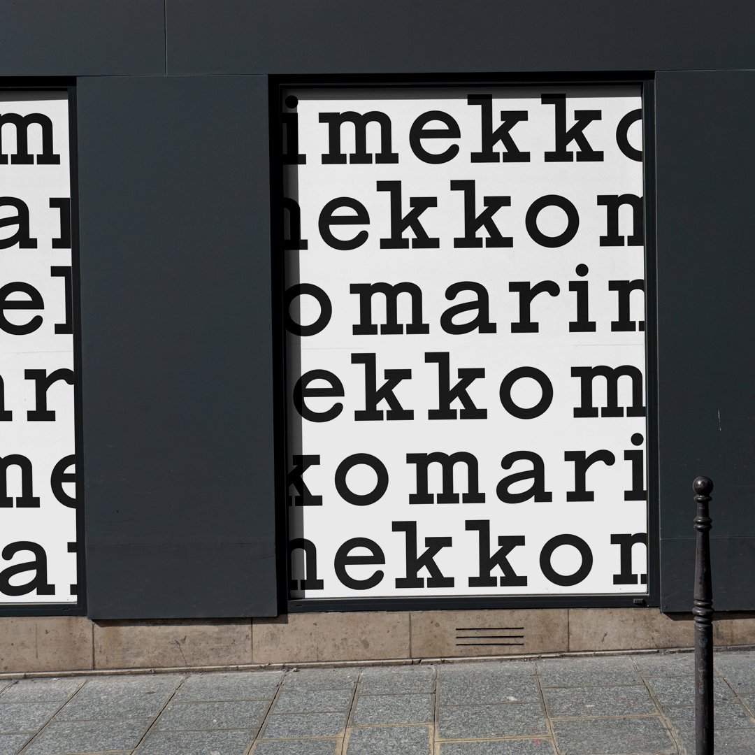
Refining of a classic. Introducing the principle assets to the renewed Marimekko brand identity. Development of a house type style through a custom typeface which is based on the character forms from an Olivetti typewriter, which the Marimekko logotype originates from. Respectful refinement and tracking adjustment to the logotype itself. Through to a series of scalable graphic language pattern which is based upon Annika Rimala’s series of essential everyday garments.


Challenge: Starting as Marimekko’s first in-house, brand-driven art director and designer, the task was to build structure and clarity where there was little before. At the time, Marimekko’s visual identity consisted mainly of a logo, Helvetica, and a loose mix of script fonts — few cohesive assets, and nothing that truly connected the brand to its heritage or to the needs of a modern, digital-first world. The challenge was to refine and rebuild the identity from within, creating a unified and enduring system. This foundational work also laid the groundwork for establishing a dedicated in-house brand and marketing team.
Approach: The renewal began by revisiting Marimekko’s origins — its bold optimism, democratic design philosophy, and focus on everyday functionality. A custom typeface was developed, inspired by the Olivetti typewriter forms that originally shaped the Marimekko logotype. The logotype itself was respectfully refined, with subtle adjustments to proportion and tracking that brought new clarity and balance across print, product, and digital applications.
Building on this typographic foundation, a flexible graphic language was created. Drawing from Annika Rimala’s series of essential everyday garments, the system introduced a modular, pattern-based structure for communication — one that could scale fluidly from packaging to retail environments to responsive digital interfaces. Every asset was designed to work across physical and digital contexts, ensuring cohesion and adaptability at every scale.
Outcome: The result is a respectfully evolved identity that reconnects Marimekko to its design heritage while preparing it for the future. The renewed toolkit — from logotype and custom typeface to modular pattern and layout principles — established a clear foundation for all brand communications. It not only strengthened the brand’s visual voice across channels, but also became the structural base for Marimekko’s in-house brand and marketing team to grow from — aligning creativity, strategy, and expression under one coherent system.