Modernizing Royal Chocolate while preserving its premium heritage involved refining core identity and packaging elements through an iterative design process. Some elements successfully reached the shelves, reflecting the brand’s history, while others were revised or discarded based on feedback, ensuring the final outcome balanced recognition with a contemporary appeal.
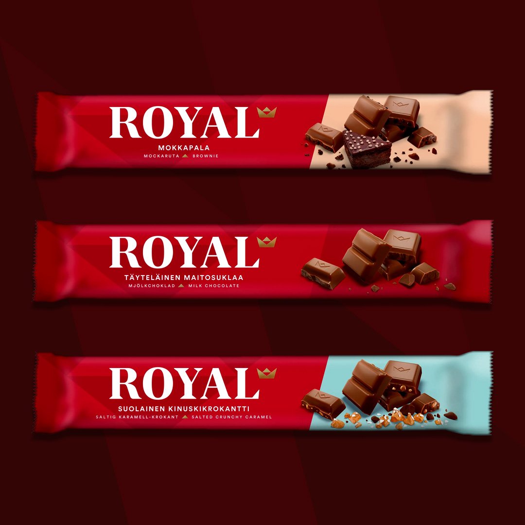
Challenge: Royal Chocolate has a long-standing heritage dating back to 1961, associated with indulgence, premium quality, and its iconic gold bar-shaped pieces. Over the decades, however, its packaging and identity had become dated, lacking a contemporary appeal while needing to retain its historic cues—the red wrapper, the crown, and the perception of luxury. The challenge was to modernize the brand identity and packaging without losing its royal legacy and recognition.
Approach: Through an iterative refinement process, I reviewed and evolved the core visual and packaging elements, ensuring every detail reflected the brand’s heritage and values. Each component—from the crown motif and red wrapper to the gold bar representation—was evaluated for relevance, recognizability, and alignment with Royal Chocolate’s history and sustainability standards (Rainforest Alliance certified, no palm oil). I explored multiple design directions, successfully implementing some elements while revising or discarding others based on consumer and brand feedback.
Outcome: The refreshed identity and packaging successfully modernized Royal Chocolate while preserving its premium heritage. Key brand elements, such as the crown, red color, and gold bar shape, were retained and subtly evolved, ensuring immediate recognition on shelves. The updated design reinforced Royal Chocolate’s premium, indulgent positioning and communicated its commitment to responsibly produced ingredients, appealing to both loyal consumers and new audiences.